;%20}%20%3c/style%3e%3cclipPath%20id=%27clippath%27%3e%3cpolygon%20class=%27cls-1%27%20points=%27-1087.08%20-568.49%20-1087.08%20775.52%20-2167.08%20775.52%20-2167.08%20-568.49%20-2064.84%20-568.49%20-1087.08%20-568.49%27/%3e%3c/clipPath%3e%3c/defs%3e%3cg%20class=%27cls-7%27%3e%3crect%20class=%27cls-2%27%20x=%27-1397.35%27%20y=%27-1337.11%27%20width=%271342.49%27%20height=%272881.95%27%20transform=%27translate(-829.97%20-622.24)%20rotate(-90)%27/%3e%3crect%20class=%27cls-1%27%20x=%27-1387.97%27%20y=%27-1327.18%27%20width=%271337.72%27%20height=%272866.85%27%20transform=%27translate(-825.36%20-612.86)%20rotate(-90)%27/%3e%3c/g%3e%3cg%3e%3crect%20class=%27cls-6%27%20width=%27490.4%27%20height=%27351.24%27/%3e%3cg%3e%3cpath%20class=%27cls-4%27%20d=%27M471.83,17.01l.04,317.22H18.54V17.01h453.29ZM245.37,295.7l188.29-120.03L245.38,55.65,57.17,175.73l188.2,119.97Z%27/%3e%3cpath%20class=%27cls-5%27%20d=%27M245.16,295.64L56.96,175.67,245.17,55.59l188.27,120.02-188.29,120.03ZM172.66,143.52c-1.73,3.91-3.15,7.96-4.23,12.1-10.88,41.7,13.54,84.45,54.99,96.27,41.45,11.82,84.76-11.61,97.53-52.76,1.28-4.11,2.21-8.32,2.81-12.58,5.44-39.16-18.8-76.35-56.84-87.18-38.04-10.83-78.24,8-94.26,44.15Z%27/%3e%3ccircle%20class=%27cls-6%27%20cx=%27245.2%27%20cy=%27175.62%27%20r=%2782.38%27%20transform=%27translate(-26.75%2045.21)%20rotate(-9.99)%27/%3e%3cg%3e%3cpolygon%20class=%27cls-5%27%20points=%27300.34%20169.77%20312.09%20140.71%20283.12%20140.71%20271.36%20169.77%20300.34%20169.77%27/%3e%3cpolygon%20class=%27cls-3%27%20points=%27277.27%20140.7%20190.04%20140.7%20178.29%20169.74%20236.44%20169.74%20236.44%20169.74%20236.44%20169.74%20212.95%20227.82%20242.07%20227.82%20277.16%20140.98%20277.27%20140.7%27/%3e%3c/g%3e%3c/g%3e%3c/g%3e%3c/svg%3e)
BR · ED.50
RIO · 2026
Drawn in the studio. Shot on the sand.
- Client
- Self
- Year
- 2026
- Origin
- Rio · BR
Brazil — full identity system, Rio de Janeiro
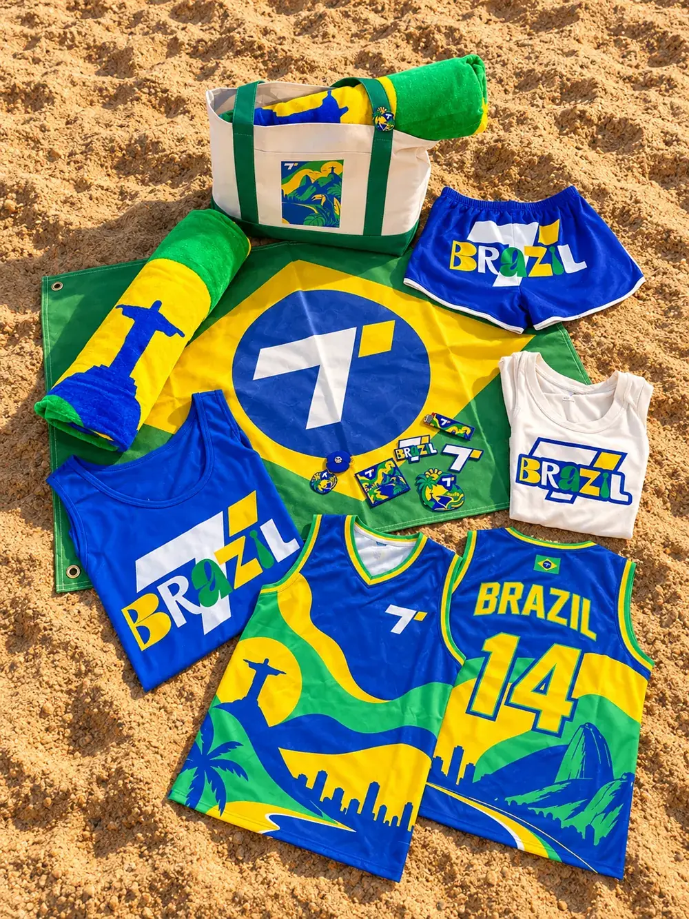
A travel capsule for Rio de Janeiro — drawn in the studio months before the trip, produced as a small object set, photographed exactly where it belongs. Full system locked before any object was produced.
Before any edit — the unedited notebook pages. Icon set, wordmarks, palette, object list, planned in blue Sharpie on paper. Below, the same marks rebuilt as vectors so the wobble survives production.

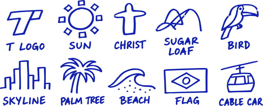

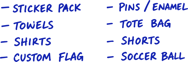
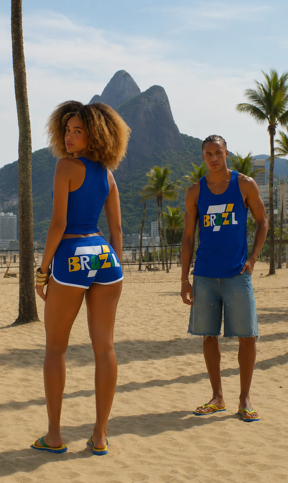
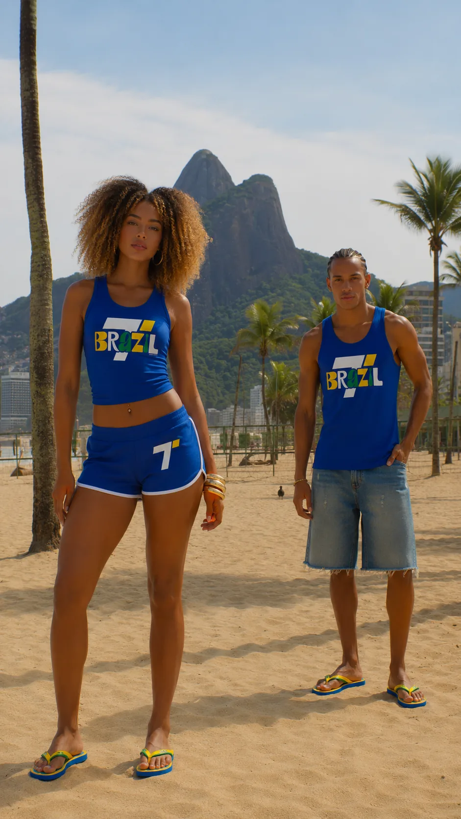
Brazil started in the studio, months before the plane ticket — the identity system already drawn, the palette already locked. Rio was the location shoot. Two weeks on the sand turning renders into real objects, photographed exactly where they belong.
Drawn in the studio. Shot on the sand.
Two primaries. Tanner is azul and amarelo. Where the two collide the overlap takes the shape of the Tanner parallelogram — the flag diamond — and drops into Brazil's verde. Two primaries, one geometry, a third country born from the intersection.
Lifted straight off the flag and paired with a warm cotton cream. Every value is production-ready — Pantone, CMYK, RGB, hex. Tap to copy.
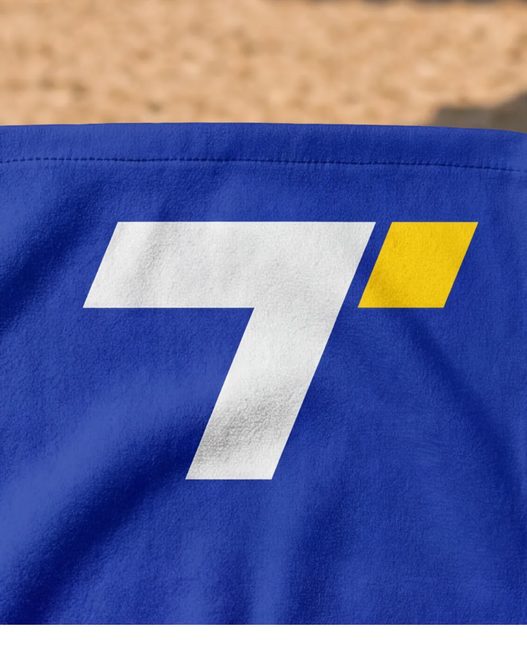
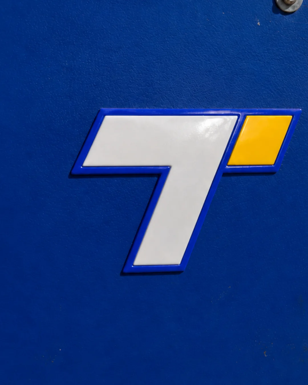
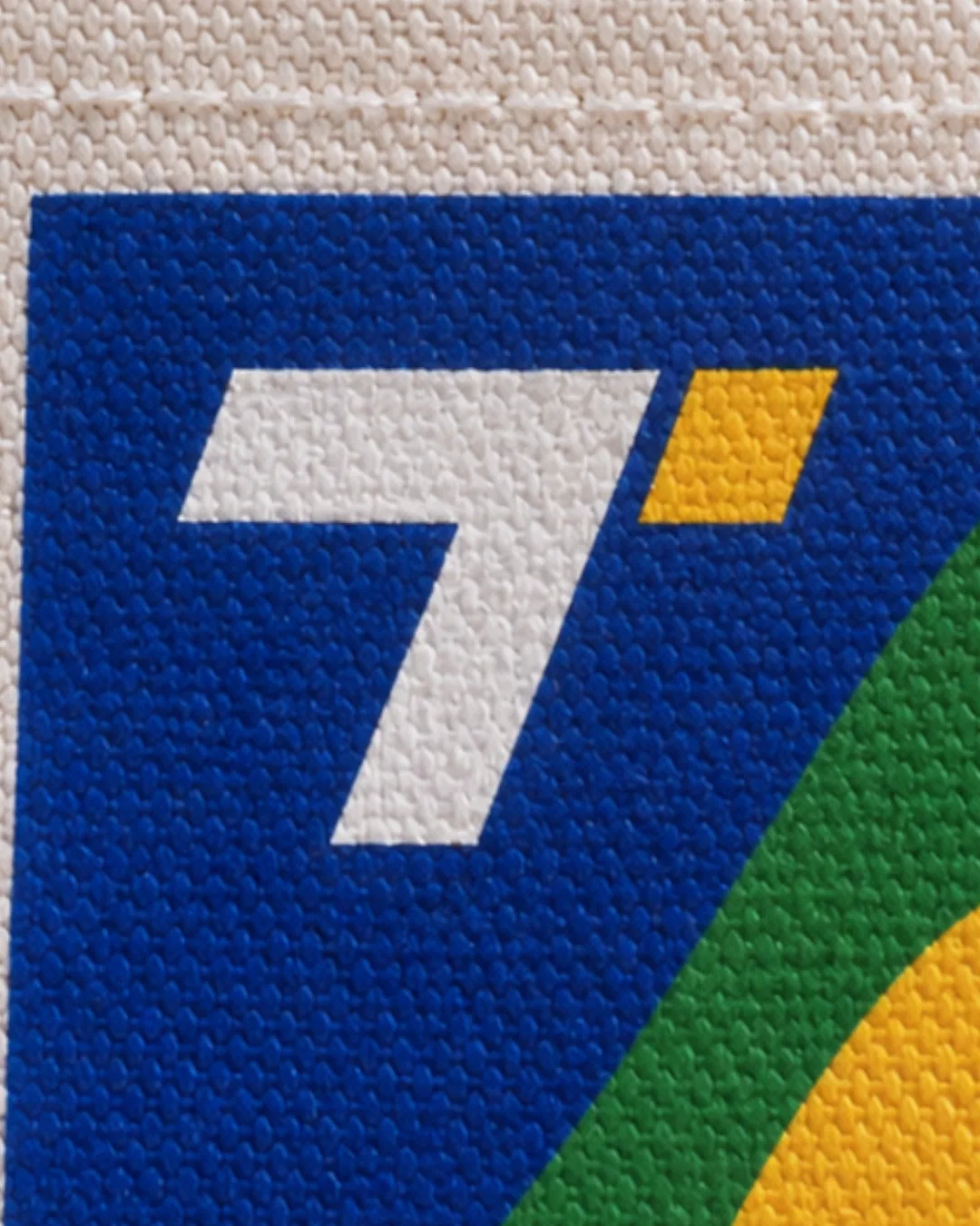
The yellow parallelogram — the T-dot that anchors the Tanner identity — is the same diamond at the heart of the Brazil flag. Rotate the dot 45° and the geometry lines up. Same shape. Same ink.
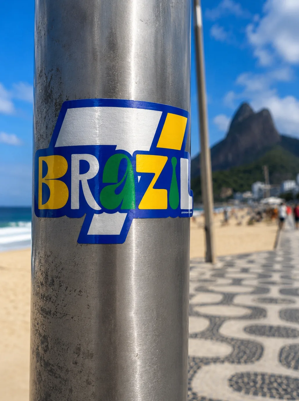
The BRAZIL wordmark isn't a font — it was drawn by hand for this collection. Every letter carries the flag's DNA: parallelogram angles, verde/amarelo/azul distribution, hand-cut curves that read louder in ink than in vector.

SOUND DESIGN / 01
The collection moves through three clear beats — from the first pencil stroke to the finished object in the wild. Each movement has its own discipline, and nothing advances until it is resolved.
References, marginalia, and fast strokes. The collection lives in sketchbooks long before it touches a screen — flag, crest, sun, silhouette.
Every stroke is rebuilt in vector with honest curves and its own typography. The paper gesture stays intact — production stops being guesswork.
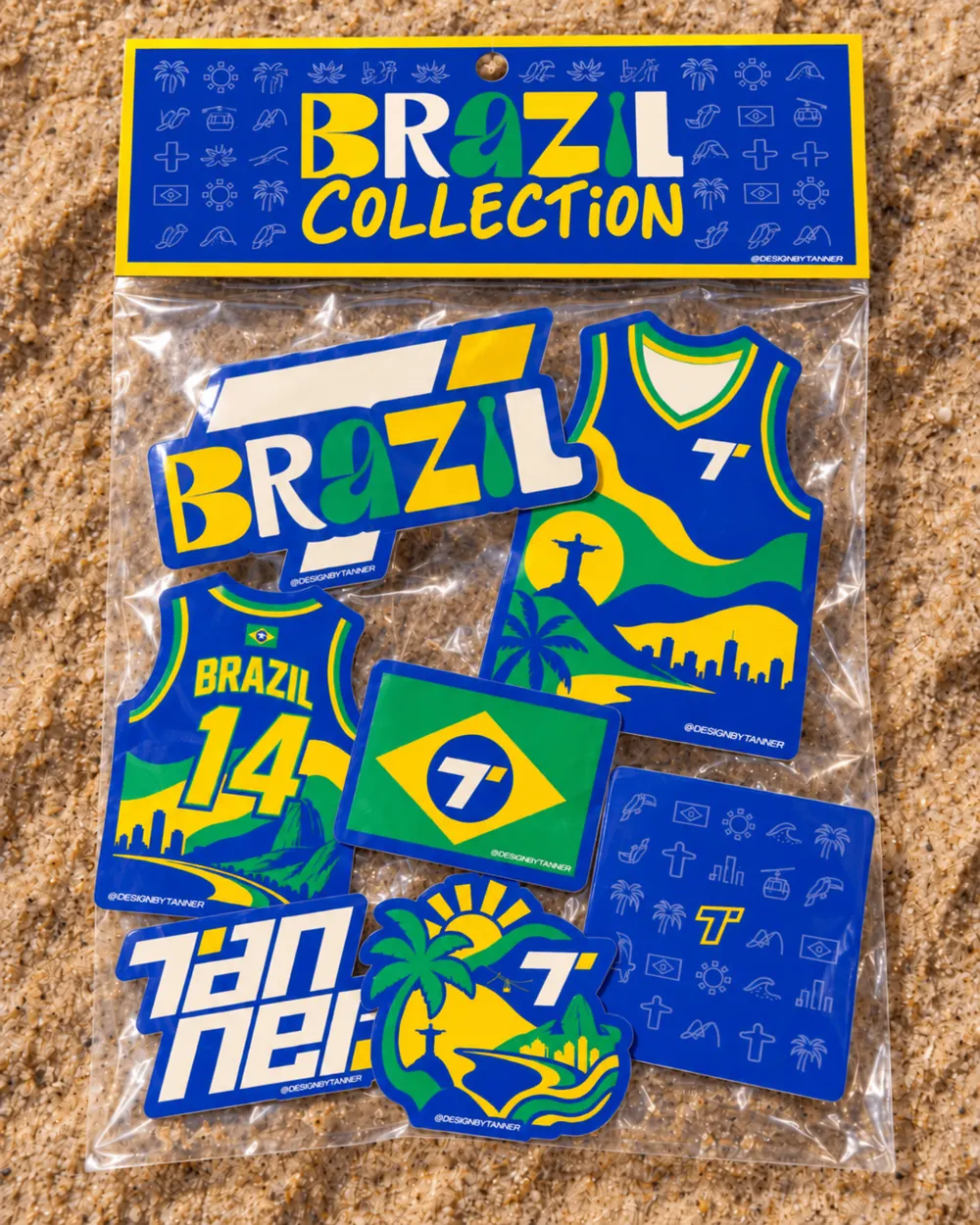
Seven pieces, curated tight — not one more. Apparel, accessory, and print read as a single sentence, never a catalog.


The full carousel and the behind-the-scenes reel.
OPEN @DESIGNBYTANNER →I've stood under Christ the Redeemer. Thirty meters of stone with the whole city at its feet — Sugarloaf, the beaches, all of Rio in one view. You don't design a collection about a place like that from photos. This one comes from being there.
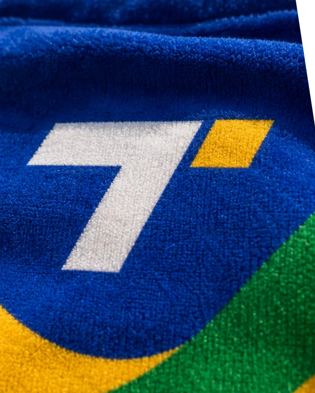
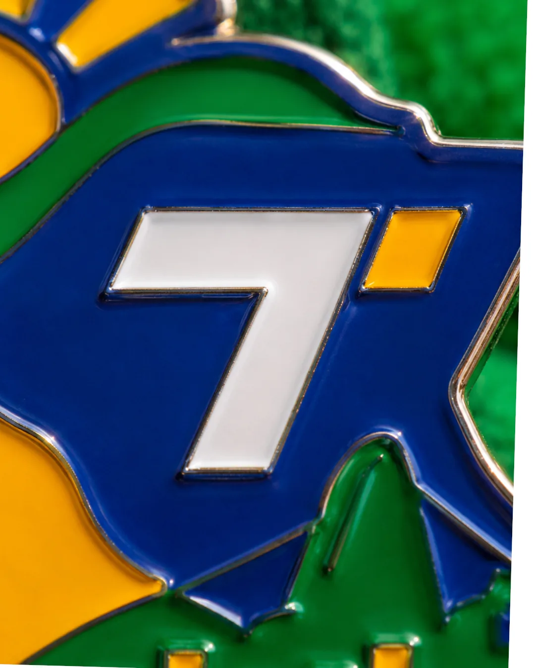
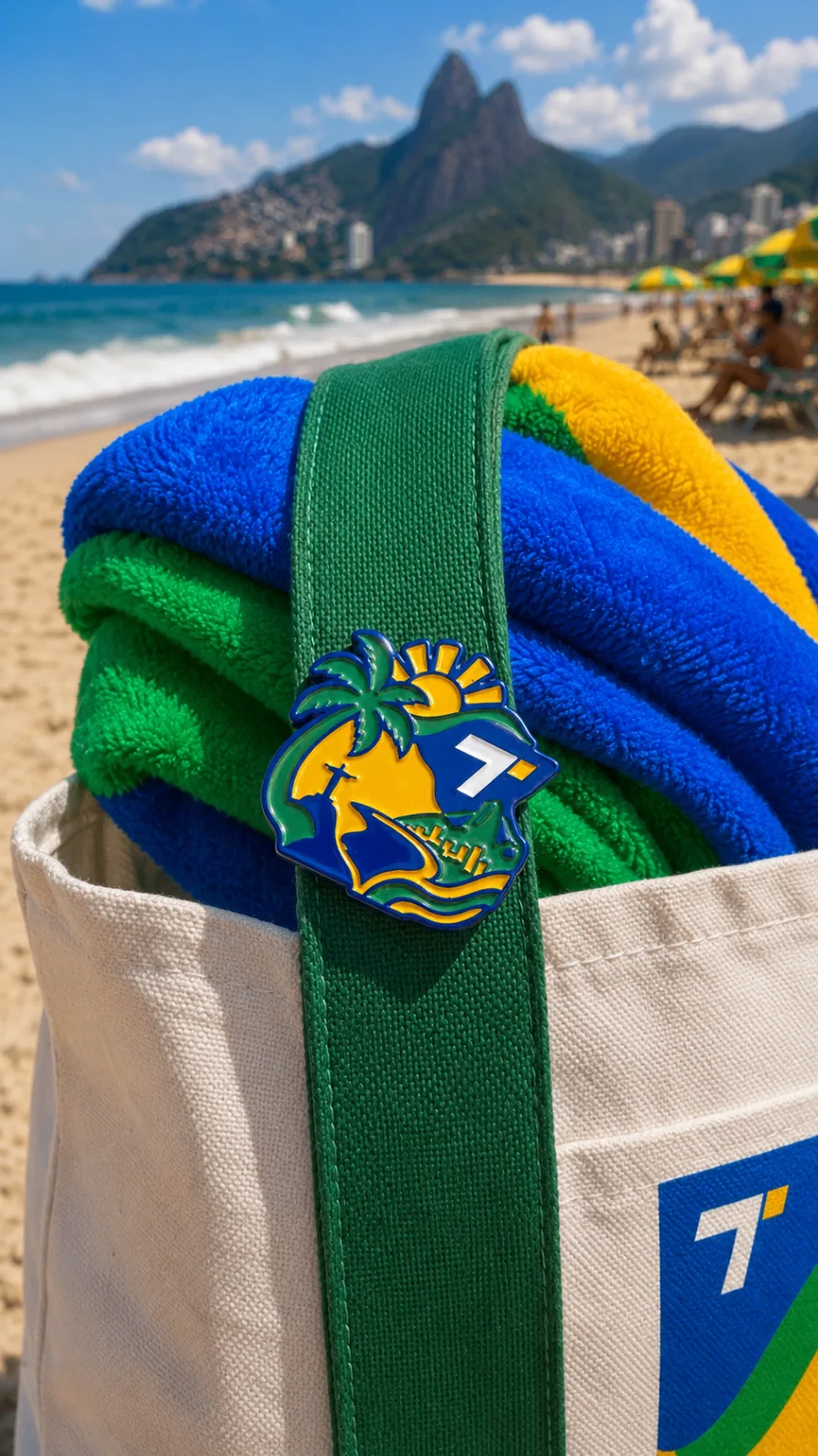
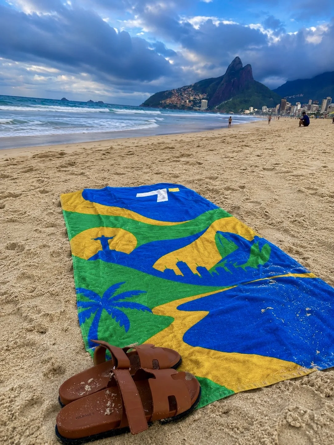
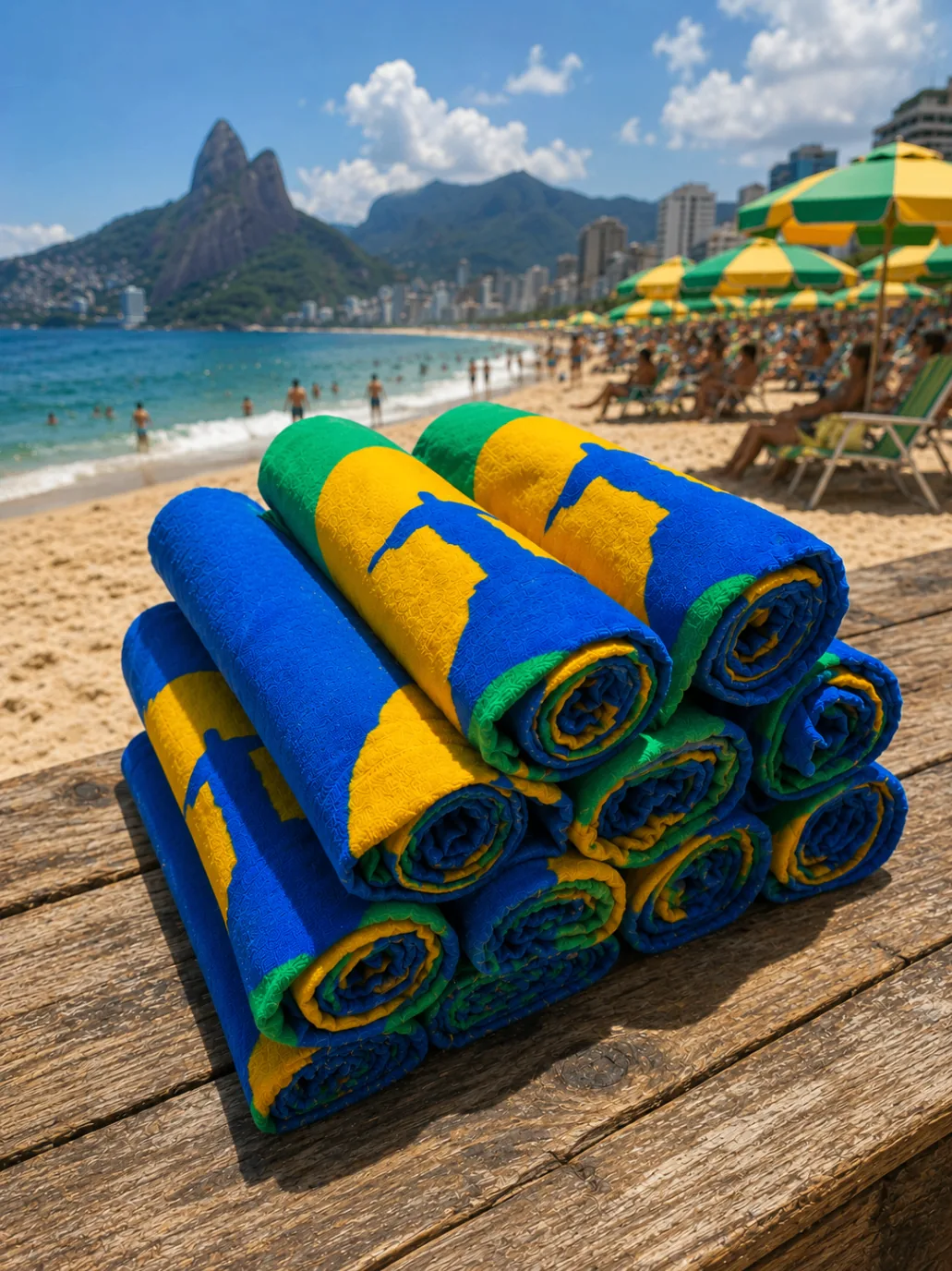
Screen on terry, silk on cotton, enamel on brass — every surface photographed close enough to feel the material.
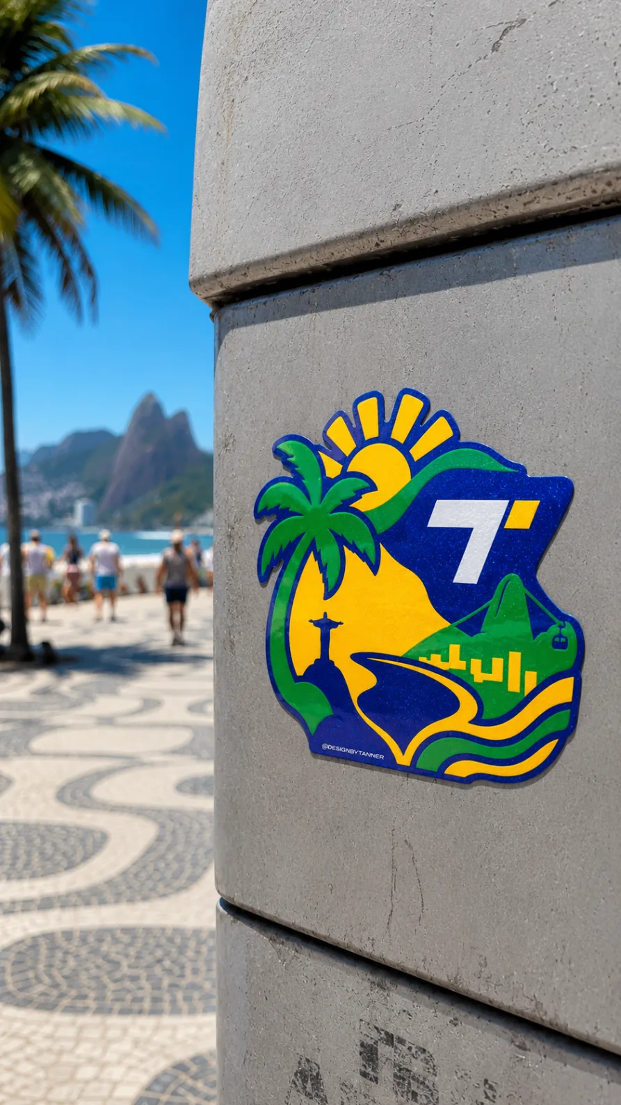
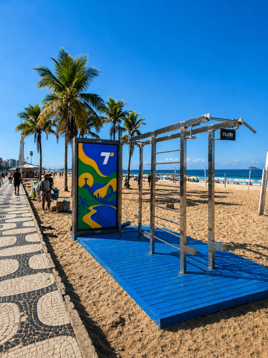
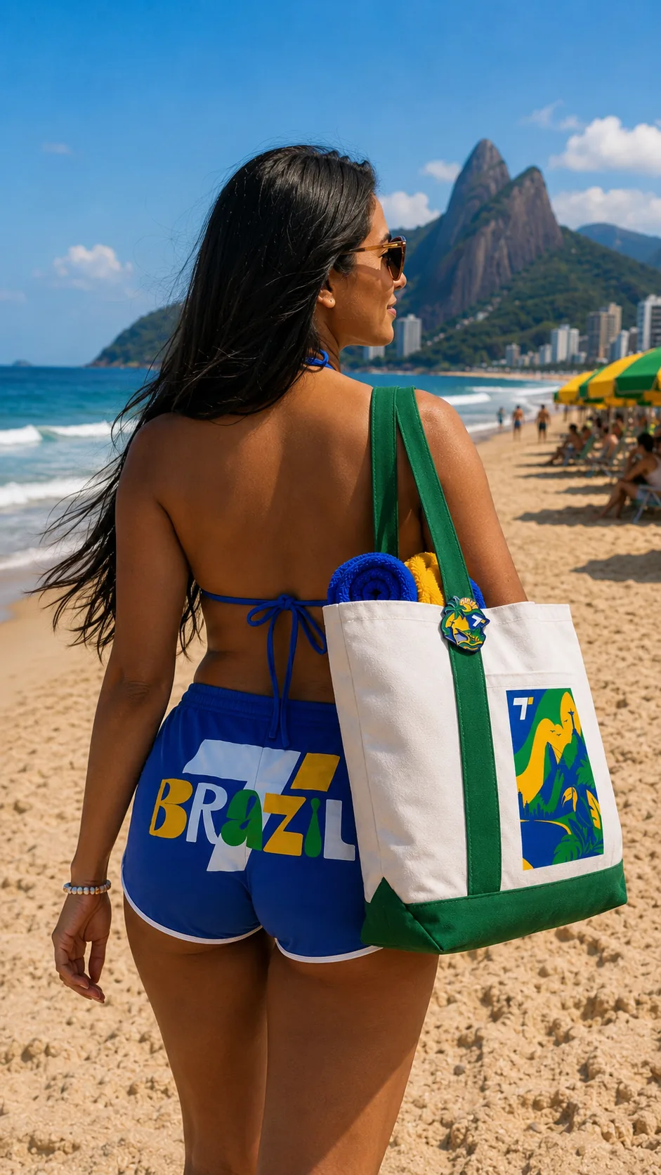
Sticker drops on poles, apparel on the sand, a one-off beach activation on the promenade — the system stretched without losing the postcard feel.
Brazil proved the model for the capsules that followed — a real trip, a real palette, a small object set that has to earn its keep. Released as a numbered capsule of 50 sets. Every copy signed.
Two weeks on Copacabana and Ipanema — the collection photographed exactly where it was designed to live.
One person, end to end — strategy, name, mark, packaging, site, and the emails that get the invoice paid. Let's make it travel.