The Pen You Already Own.
An independently developed exploration of marker culture, typography, packaging and creative expression by Design by Tanner. A portfolio project — not a Sharpie® product, collaboration or licensed collection.
Ceremony Around The Ordinary.
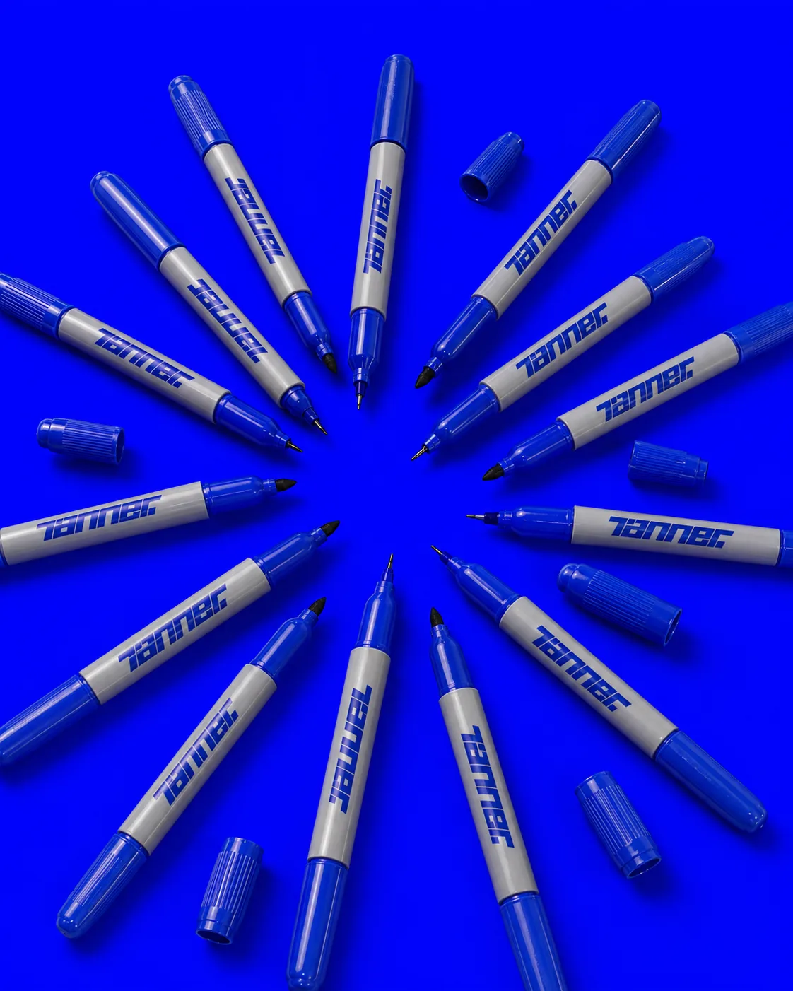
Every project starts with a Sharpie. Everyone has one in the house — the desk drawer, the tool bench, the kitchen counter. Mine is always the blue one. It's the first tool of every project I touch.
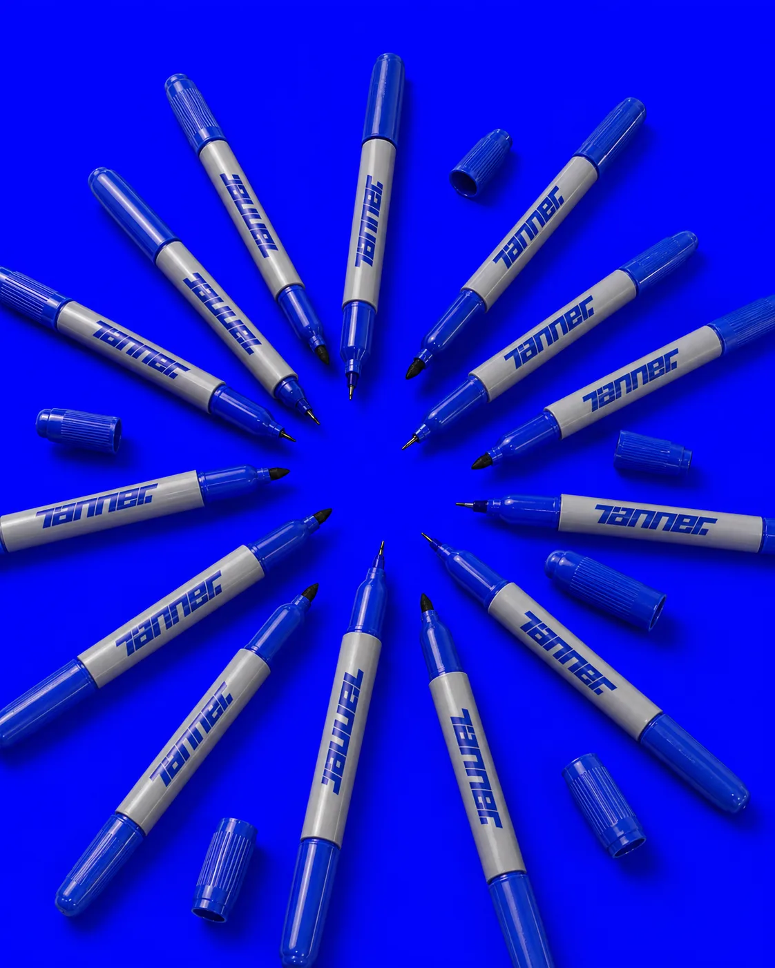
So I made packaging for it. A personal collection built around the pen I already reach for — Fine and Ultra Fine tips, Tanner Blue permanent ink, treated with the same intent I'd give a client release. Made for the process, not for shelves.
The starting point wasn't a new product — it was a new ceremony around one I already owned. Packaging, dielines, and campaign art all borrow the language of collector goods so the marker on my desk feels weighted with the intent it deserves.
SKU 32002. Anchor Point.
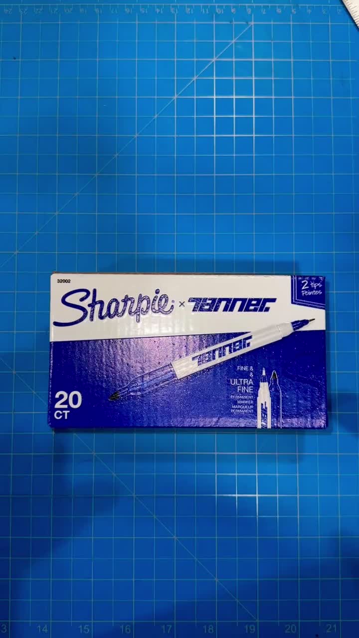
Fine and Ultra Fine, permanent ink, dual-tip. The 32002 SKU anchors every dimension downstream — the pack, the dieline, the print bleed, the numbered insert. One object, honestly specified.
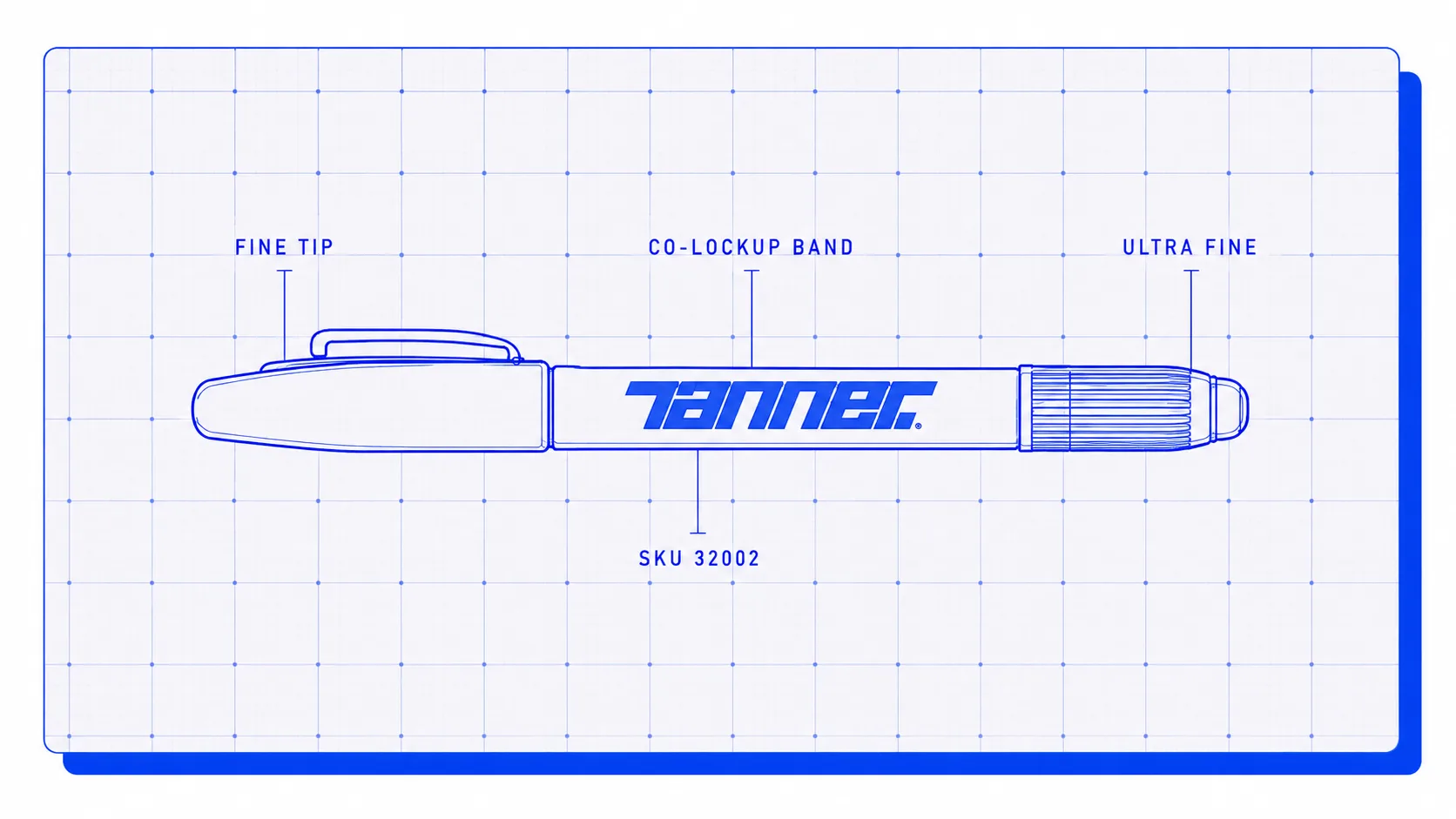
Pulled decades of Sharpie packaging, spec sheets, and pen anatomy. The 32002 became the anchor because it's the SKU that lives in every desk drawer — the object you already trust. Every downstream dimension is measured off it.
Two Marks, Side By Side.
A study in pairing marks — how the Sharpie® wordmark and the Tanner mark hold together on one object, rendered mask-based so each stays crisp at any scale. An exploration, not a partnership.
Locked the palette to a single Tanner Blue on paper white. Clearspace equals the width of the ligatured S; minimum size is 14mm wide before the counters start to close.
Four Faces. Nothing Freelances.
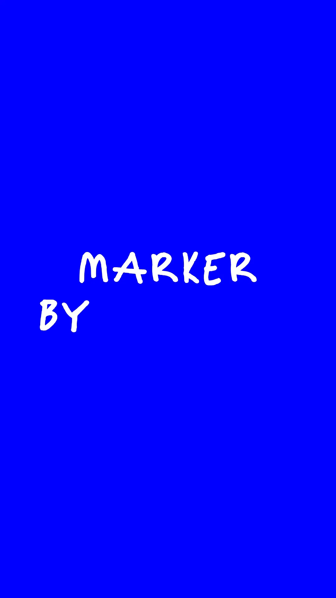
PP Monument Extended for headlines — heavyweight and extended enough to feel like ceremony. Barlow Semi Condensed for body, spec, and captions — a working editorial voice that reads clean at any size. Marker by Tanner at the thick 900 nib stamps heading accents; a companion handwritten notes face — the TNR Ultra Fine hand — carries Permanent Notes and the quieter body-side beats. Four faces, one voice.
Monument earns headline duty because its cut carries momentum without shouting — the same reason the marker feels weighted in the hand. Barlow Semi Condensed does the reading and the paperwork. Marker by Tanner stamps the heading accents at the thick 900 nib; the TNR Ultra Fine hand holds the Permanent Notes and body-side hand moments. Two nibs, one voice — same as the pen itself.
One Blue. That's It.
Paper white is the surface. Tanner Blue is the mark. Two values — nothing else in the system.
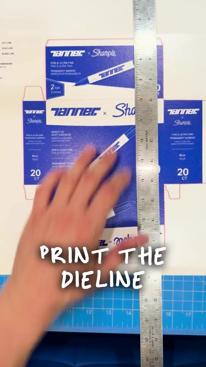
Dieline First. Ceremony Second.
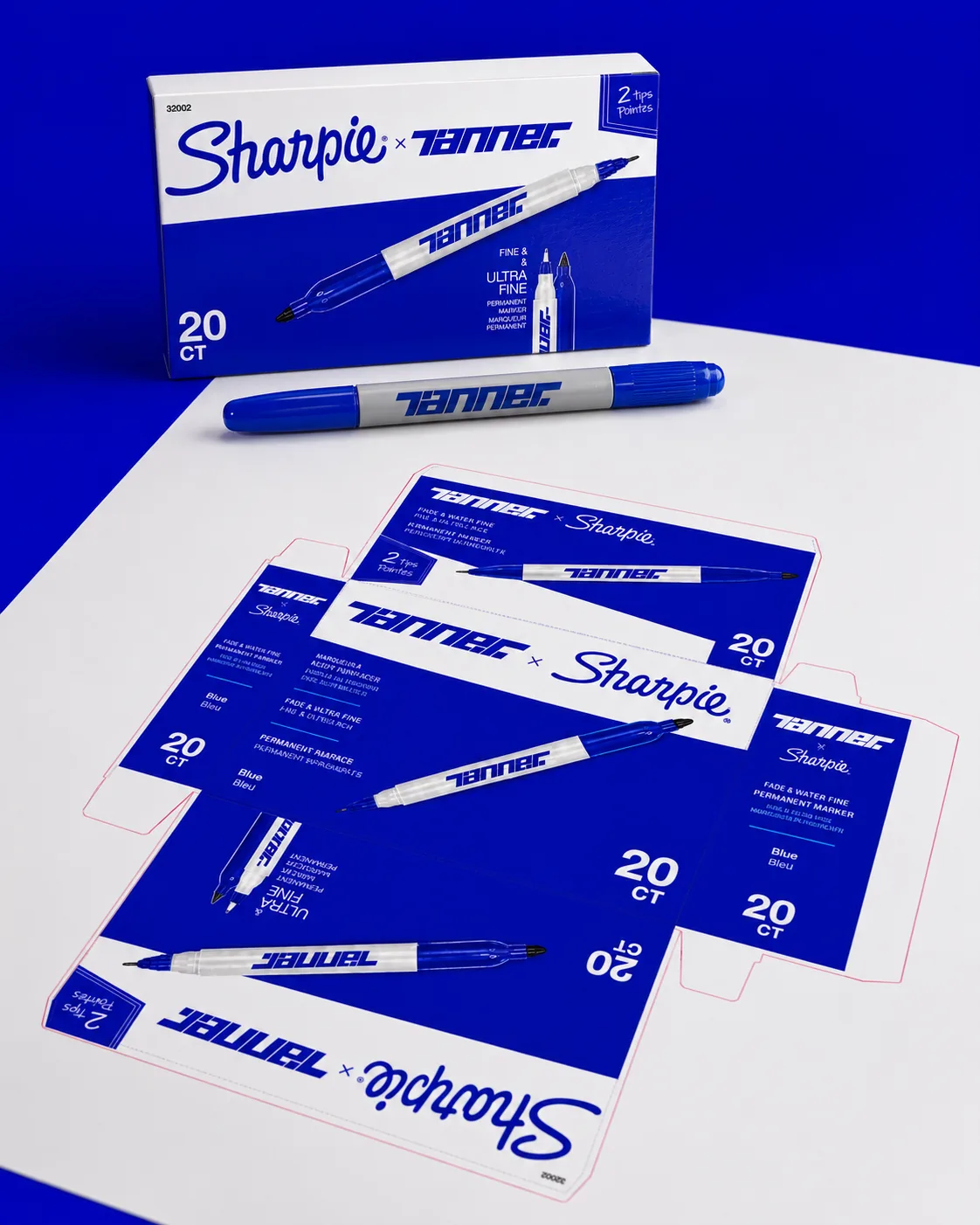
Every fold, glue line, and bleed drawn to real manufacturing tolerances. The pack was never a mockup — it was a spec.
Object. Frame. Repeat.
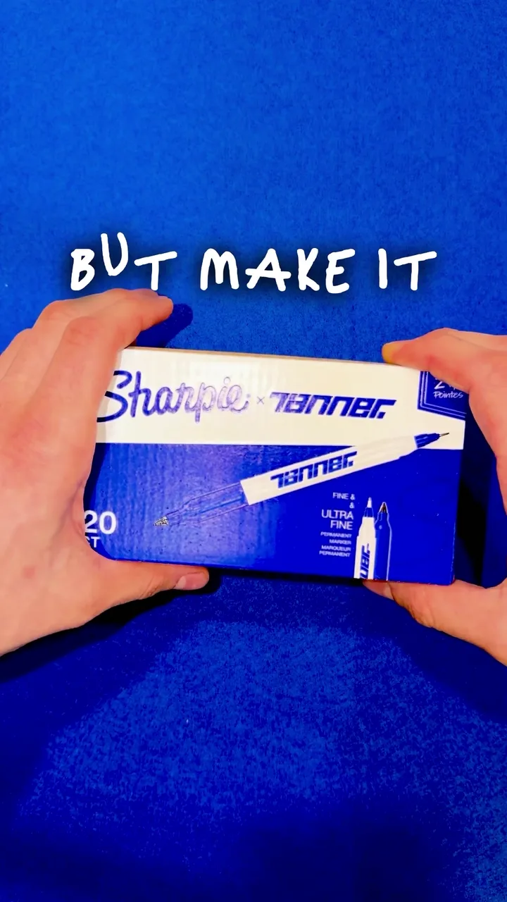
Studio-shot object frames. Numbered inserts. Campaign cards. The release lived on the object first, the surface second.
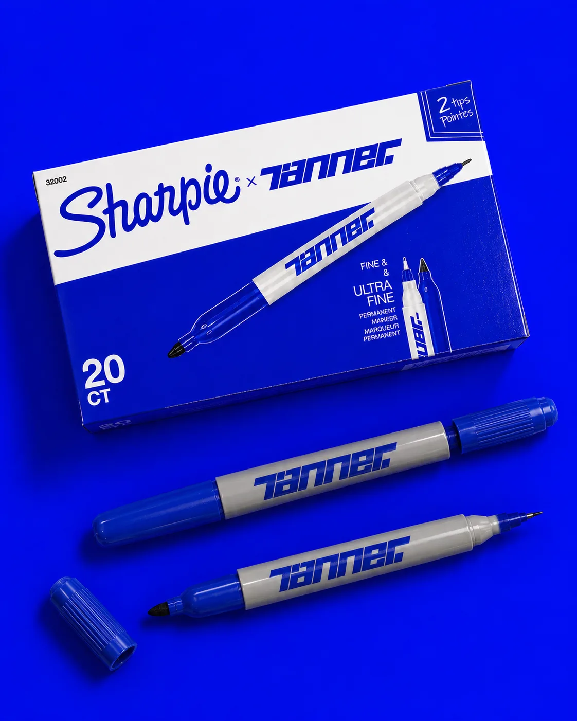
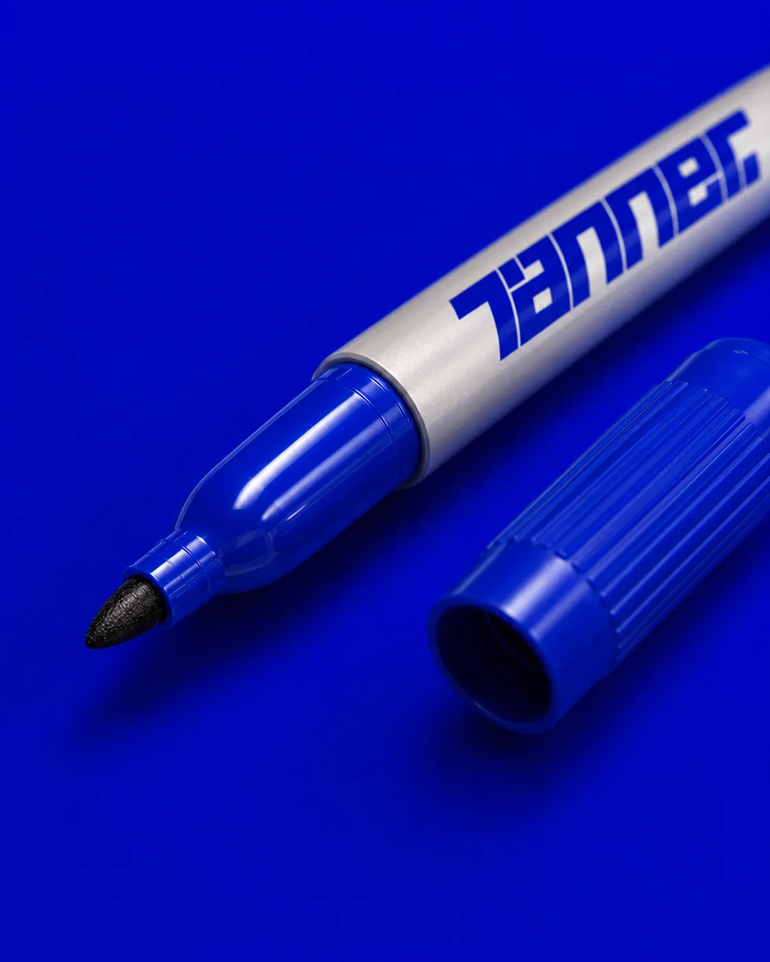
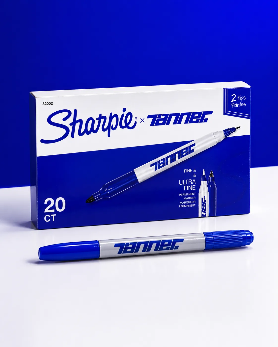
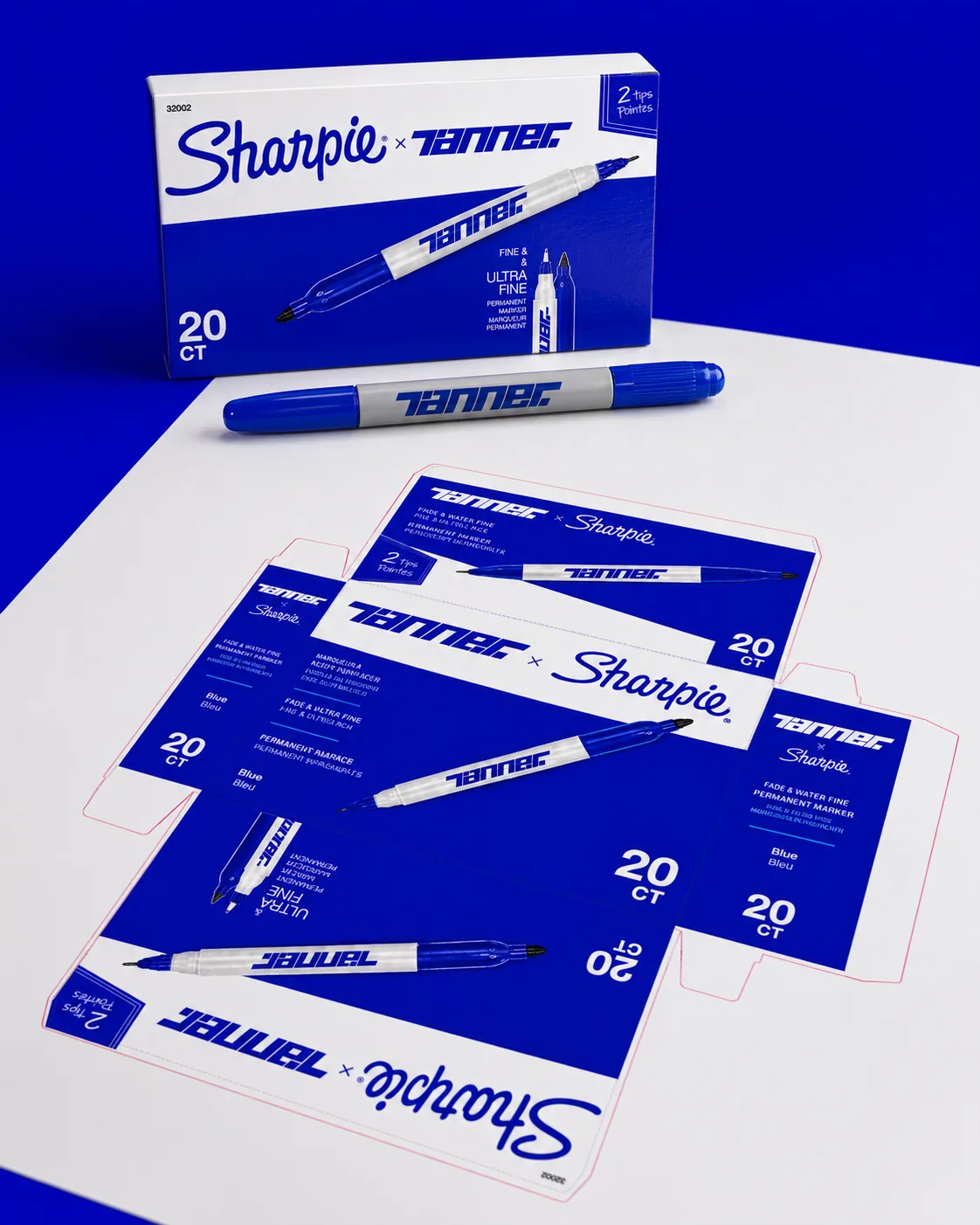
20 CT. Numbered.
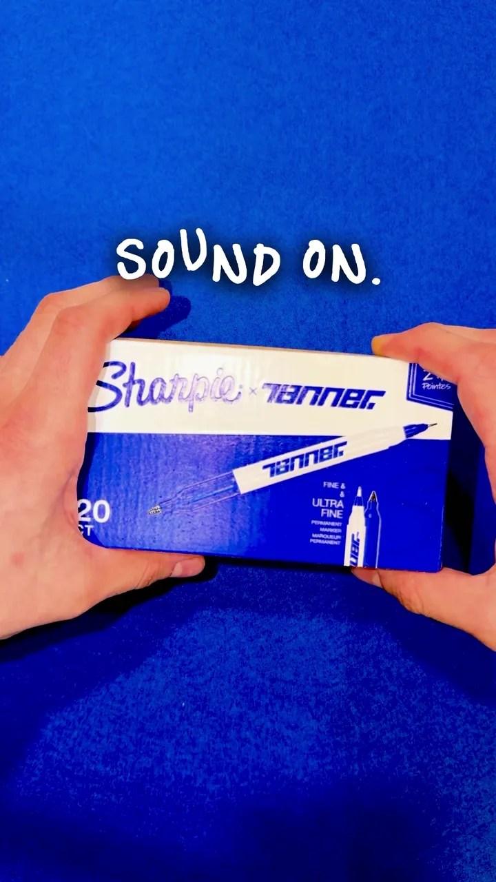
Delivered as a 20-count run with numbered inserts, a campaign card reel, and a series of studio-shot object frames. Every copy is registered — none anonymous.
MARKER BY TANNER
One Sharpie. Every letter drawn by hand, traced to vectors, compiled into a working typeface — now in five weights.
The Reference For Everything After.
A personal collection, printed and packaged for the pen I actually use every day. No launch, no shelf, no shop — just real production files, real packaging, and a small run of the blue Sharpie treated with the ceremony it earns by being the first tool I reach for. The study I do for clients, turned inward.
Made for The Feed.
Want a Collection Like This for Yourself?
One person, end to end — strategy, name, mark, packaging, site, and the emails that get the invoice paid. Let's make it permanent.