An Honest Service Company.
Turf cleaning is a trust business. You're letting a crew into your backyard. The identity borrows from the golden era of American service companies — milkmen, gas stations, repair vans — when a uniform and a script logo meant the job got done right. Modern service, vintage handshake.
The tell was the yard-sign test: at 40 mph from the street, most "modern" logos vanish into shrubs. A script wordmark with a heavy keyline reads as ownership — someone actually did the work here. That legibility budget shaped everything downstream: patch weight, van panel scale, invoice header size. If a mark can't hold up staked in dirt, it won't hold up on a phone screen either.
Flex Your Turf.
Turf says what it is. Flex says what it does — restore, revive, show off. Two syllables, easy to say on the phone, easy to read on a van at 40 mph.
Naming rules I set before writing a single option: two syllables max per part, says the category, survives a phone call, and owns a verb. Turf is the category. Flex is the promise — restore it, then show it off. It also handed me the tagline for free: Flex Your Turf. The double-f collision in the middle became a feature, not a problem — see the logo.
A Script That Works.
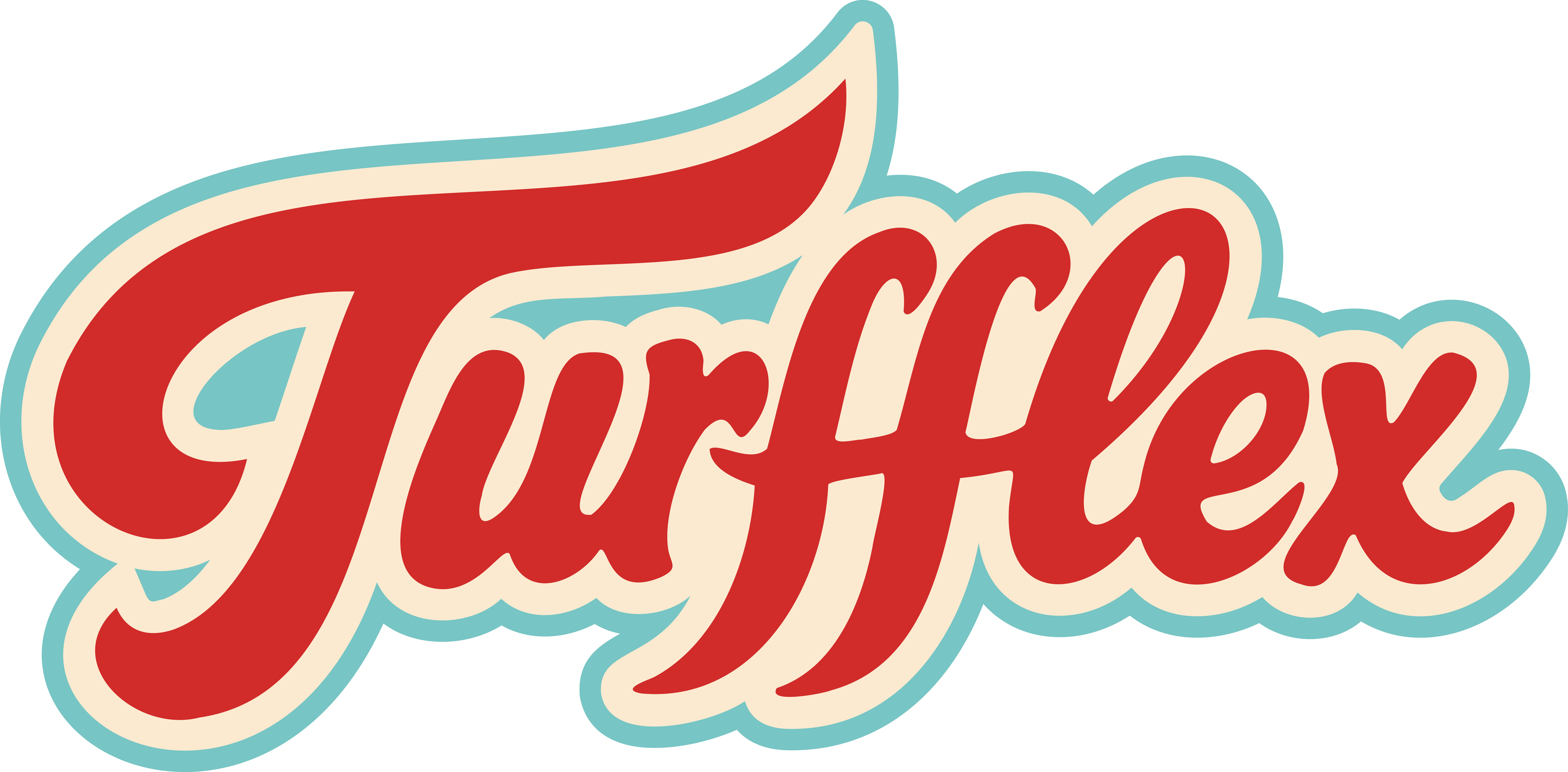
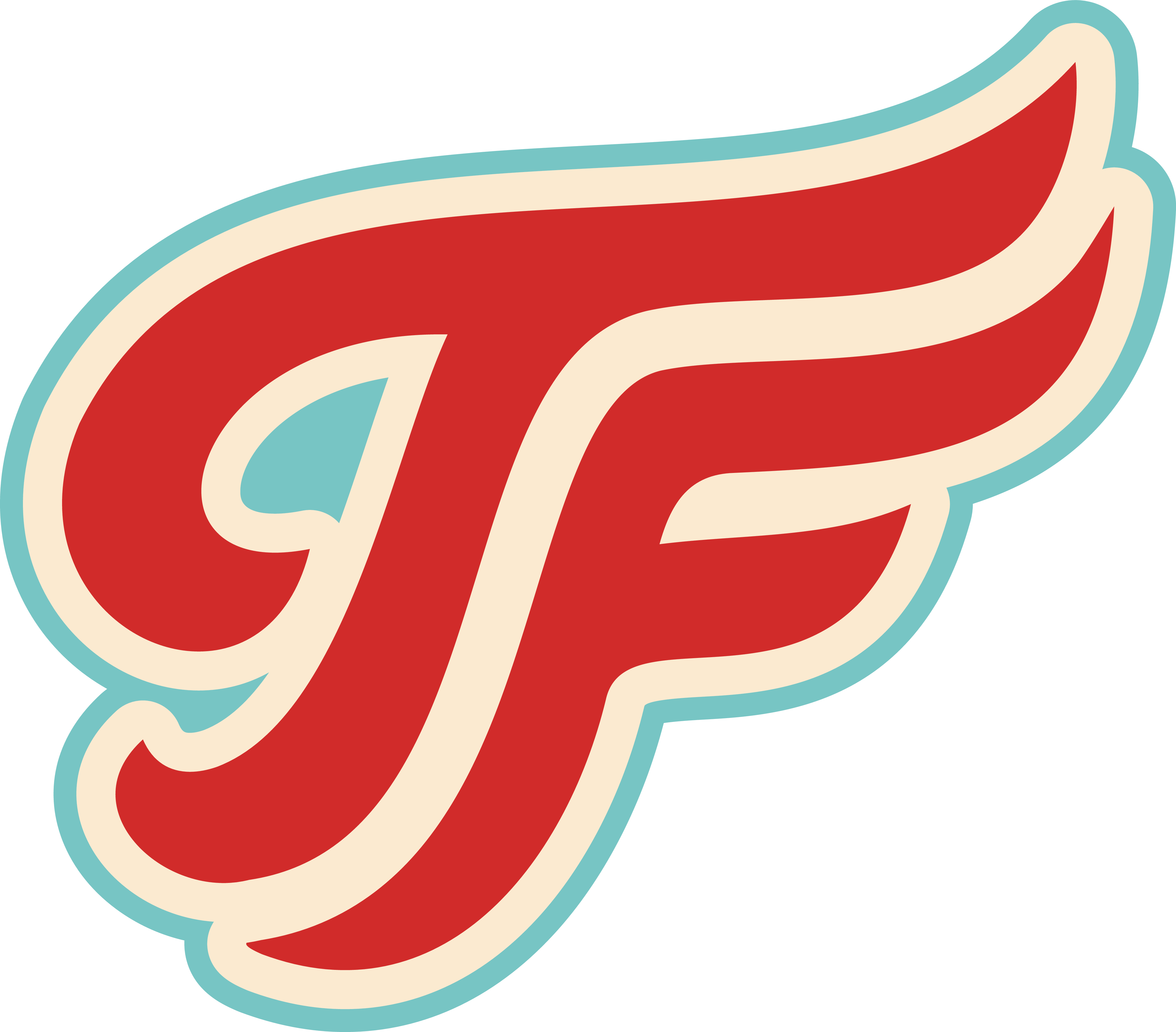
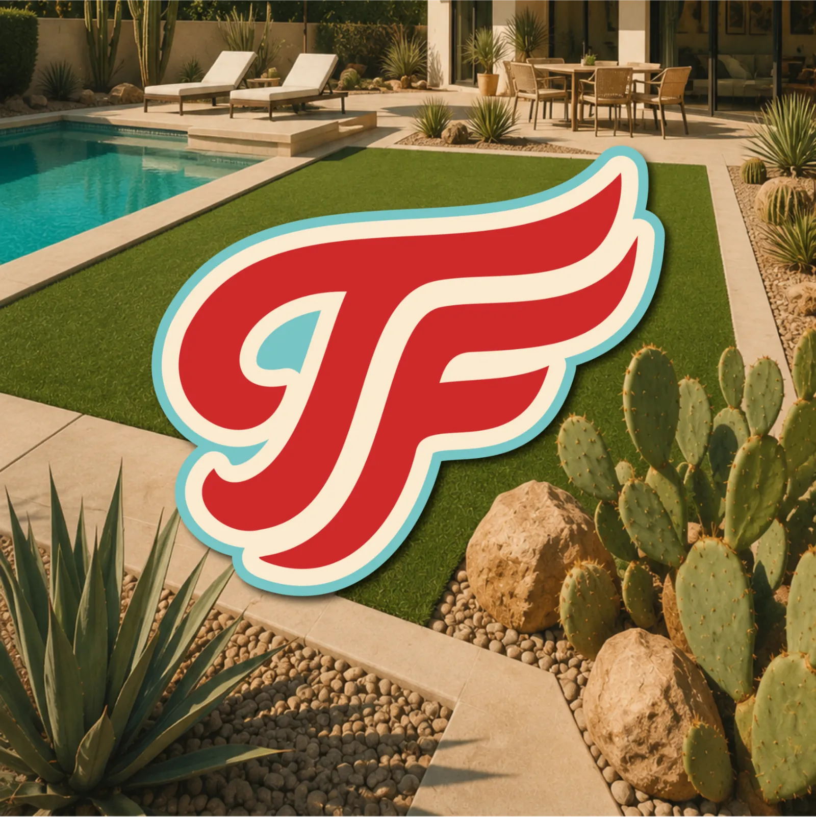
A custom vintage script wordmark and a winged TF monogram — the monogram's T-tail and F-arm are drawn as sweeping turf blades that "wing" outward from the ff ligature. The outer curves echo turf in motion — brushing, sweeping, bringing a lawn back. Drawn to stay legible on vehicle graphics, chest patches, and yard signs.
The outer curves echo the movement of turf blades, connecting the mark directly to the service.
Designed to remain legible from vehicle graphics, uniforms, and yard signage.
Inspired by classic American service businesses and workwear branding.
The flowing forms suggest brushing, sweeping, and bringing turf back to life.
- 1Turf-Inspired Edges
The outer curves echo the movement of turf blades, connecting the mark directly to the service.
- 2Service-Style Script
Inspired by classic American service businesses and workwear branding.
- 3Highly Visible Forms
Designed to remain legible from vehicle graphics, uniforms, and yard signage.
- 4Motion & Restoration
The flowing forms suggest brushing, sweeping, and bringing turf back to life.
The Mark at Work
Approved Lockups — One Color
The wordmark is custom-drawn script, not a font. The decision point was the ff — two names colliding in the middle. Instead of hiding it, I ligatured it into the centerpiece of the mark. The T's tail and the F's arms are drawn as turf blades mid-sweep — the motion of the actual service. Every curve had a legibility test: chest patch at three inches, van panel at 40 mph, yard sign from the street. Three-layer construction — red, cream keyline, aqua halo — so it holds on any background without a box.
Four Voices, One Crew.
Scriptorama Tradeshow JF for name tags — the human touch. Thumpa for headlines — loud enough for a billboard. Courier for detail text — the work order. DIN 2014 for documents — the paperwork. Every tier has a job.
The type system is cast like a service crew. Scriptorama Tradeshow JF is the name tag — the human who shows up. Thumpa is the truck-side headline — zero subtlety, reads across a parking lot. Courier is the work order and the invoice — monospace still means official paperwork to anyone who's hired a contractor. DIN 2014 handles documents because paperwork should be boring and clear. Four voices sounds like a lot; the rule that keeps it tight is each one is locked to a job. Nothing freelances.
Three Colors. No Confusion.
Cream carries the surface. Red points the eye. Aqua accents the details. Blacktop carries the type. Every color has one job — and one place it belongs.
The 60 / 30 / 10 Rule
Three colors, each pulled from the world the company works in. Turf Aqua is a Phoenix pool on a good day — the backyard everyone wants. Service Red is the classic service-industry signal. Workwear Cream is the uniform itself — most brands would default to white; cream is what workwear actually looks like, and it ages better in the sun. The discipline is the ratio: cream carries, red points, aqua accents. When everything shouts, nothing books.
Sounds Like A Handshake.
The voice system is three words: Clear. Confident. Helpful. No fine print, no hedging, no corporate padding — copy that sounds like a crew you'd trust with your gate code.
Headline Bank
- Flex Your Turf.
- Built for the desert. Trusted by neighbors.
- One rate. No surprises.
- Four steps. Zero hassle.
- From dusty to downright dazzling.
- Your turf called. It wants its flex back.
Voice was designed like the logo — rules first. Three words on the wall: clear, confident, helpful. Every headline gets tested against them. If a line sounds like a corporation wrote it, it dies. If it sounds like a neighbor who's good at his job, it ships.
The Hardware.
Blacktop-outlined cards with a hard offset shadow. Every surface — quote, invoice, service block — feels stamped onto the page like a shop-window sticker.
Heavy directional shadows add depth and a tactile, printed feel.
Aqua and red rules create rhythm and connect the full system.
Every CTA is a red pill with a hard Blacktop shadow. Same shape on the van door, the site header, and the balance-payment email.
The hardware kit exists so the brand survives without me. Anyone building a flyer or a landing page picks from four parts and it still looks like TurfFlex. Offset shadows are the tell: they make digital surfaces feel printed, like a sticker on a clipboard. The stripe is the thread that runs from the website header to the van to the email footer.
In The Wild — Environmental
The Crew Looks the Part.
Embroidered patches on workwear cream, gloves with the TF mark, and a two-tone van you can spot before the crew opens the door. The brand shows up before the doorbell rings.
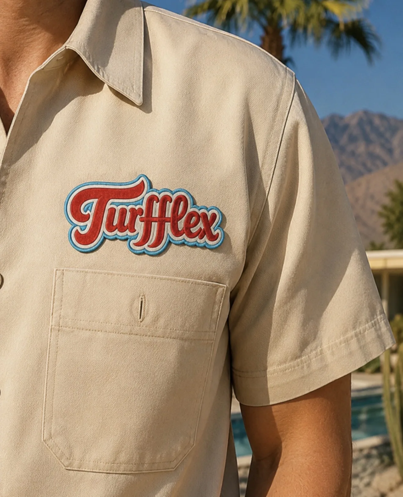
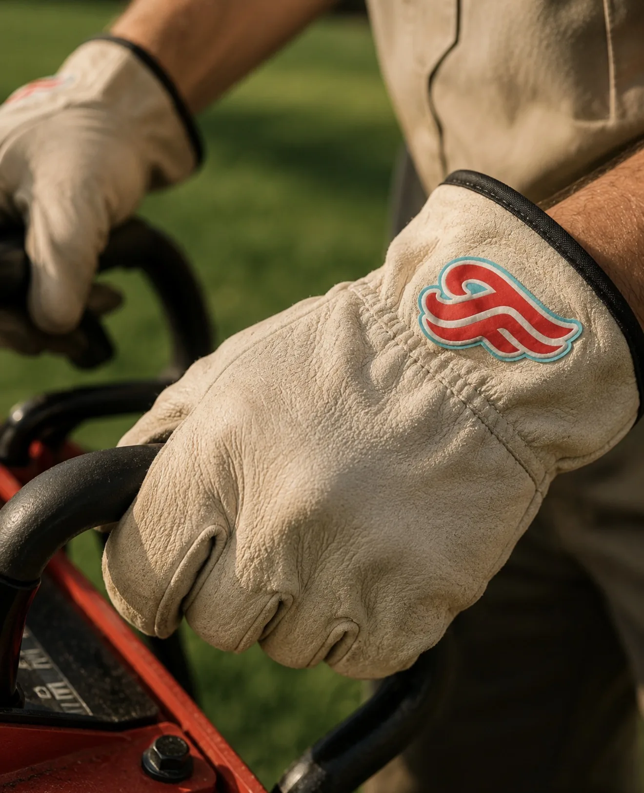
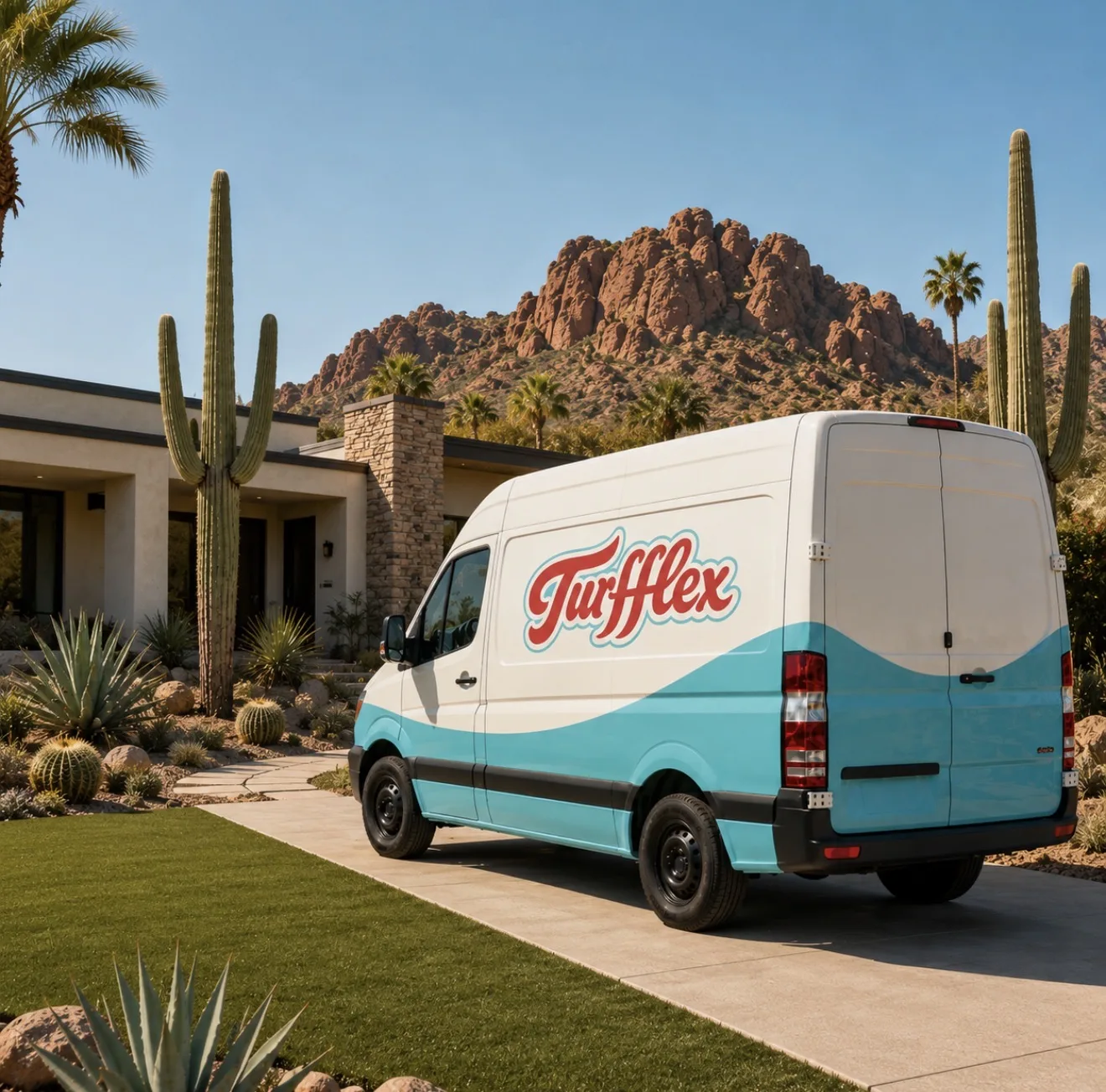
The uniform program was designed before the website. In home services, the first brand impression is a human at the door and a van at the curb — the site comes second. Embroidered patches instead of screen print: patches read as earned, print reads as cheap. If the identity only worked on screens, it would have failed the actual business.
Booked in Two Taps.
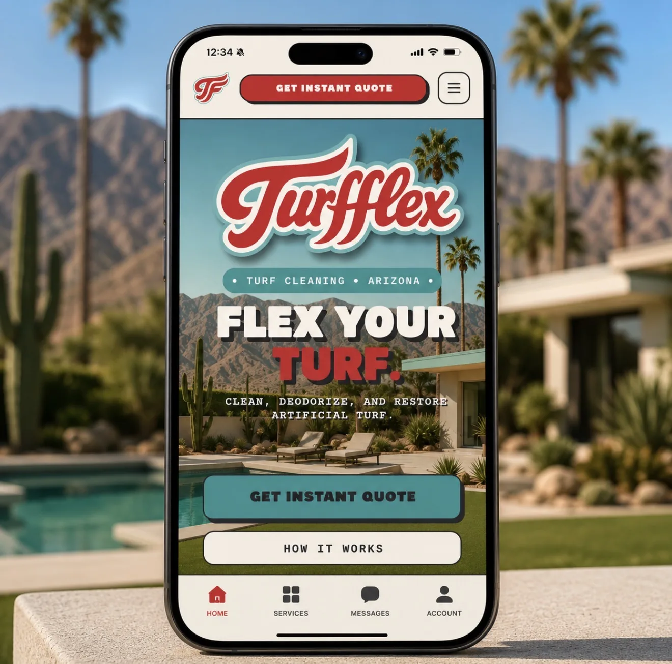
Website, mobile app, and automated email flow — instant quotes, service-area coverage, balance payments. One identity from the yard to the invoice.
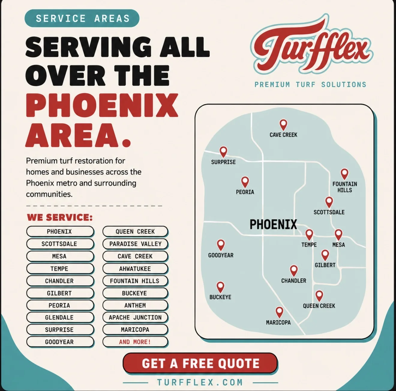
We Service
- Phoenix
- Queen Creek
- Scottsdale
- Paradise Valley
- Mesa
- Cave Creek
- Tempe
- Ahwatukee
- Chandler
- Fountain Hills
- Gilbert
- Buckeye
- Peoria
- Anthem
- Glendale
- Apache Junction
- Surprise
- Maricopa
- Goodyear
- And More!
The digital rule: same script, same stripes, from driveway to inbox. Quote friction is where service companies lose jobs, so the system removes the quote call entirely. Most companies brand the homepage and send invoices that look like ransom notes; here the balance email got the same identity as the van — and the coverage map lives on the landing page so a Chandler customer knows in one glance they are in the service area.
The Work Order.
- 01Naming✓
- 02Logo System✓
- 03Color + Type✓
- 04Uniform Program✓
- 05Vehicle Graphics✓
- 06App UI✓
- 07Web Design✓
- 08Email System✓
- 09Client Portal✓
Every line on this work order was closed by one person — no agency layers, no handoffs, no drift between the strategy deck and the van wrap. That's the studio model: connecting the dots from idea to final production.

TURFFLEX · SOUND DESIGN
THE HAPPY GROOVE.
The Whole Kit.
Every logo variant in one ZIP — full color plus one-color red, black, and white, each as SVG and PNG.
Personal and portfolio-review use. Contact for commercial licensing or extended-use rights.
Need a Brand Built Like This?
One person, end to end — strategy, name, mark, packaging, site, and the emails that get the invoice paid. Let's flex your turf.