TAP.
A dark, technical identity built around a single icon — the star-arrow — with a strict color, type, and pattern system. Everything the TAP identity is built from, in one place.
What TAP Is.
TAP is a design-forward object label. Tanner built the full identity — mark, icon, color system, type, and pattern — and shepherded it into physical goods: cases, jars, bags, patches, and hardware. This page is the identity system itself, drawn straight from the source boards.
Six Routes. One Mark.
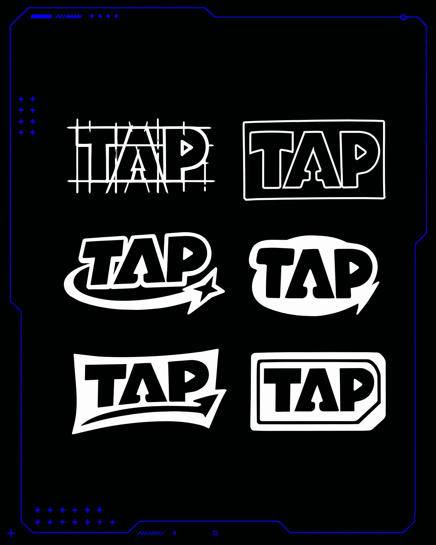
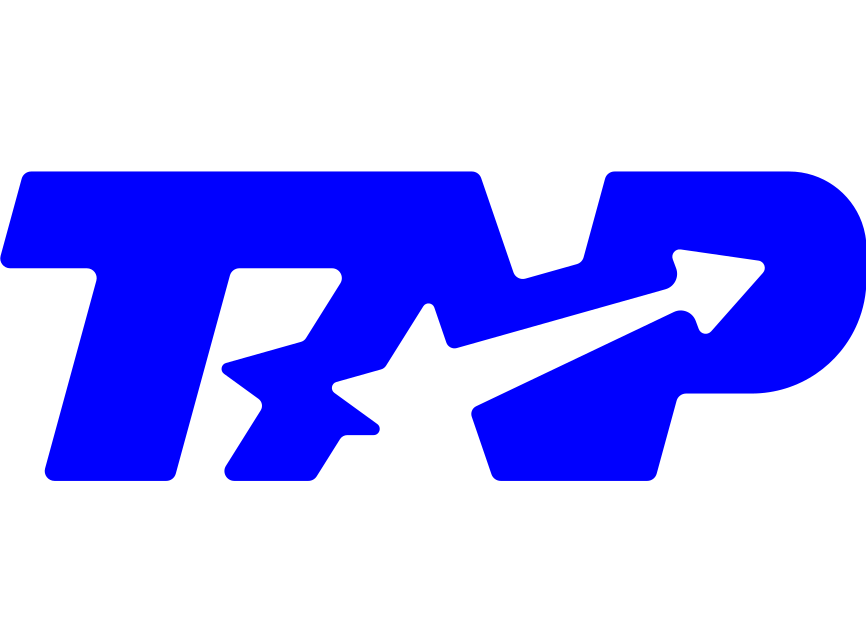
Wordmark + Icon.
Two elements. The bubble-outline wordmark carries the name; the star-arrow icon carries the signal. Either one works alone — together they lock the system.

Four Values, One Signal.
A four-value system: Ink, Blue, Paper, and Chrome. Ink owns the field, Blue owns the signal, Paper carries type, Chrome lives on hardware. The ratios are fixed — the identity reads as one system across every surface.
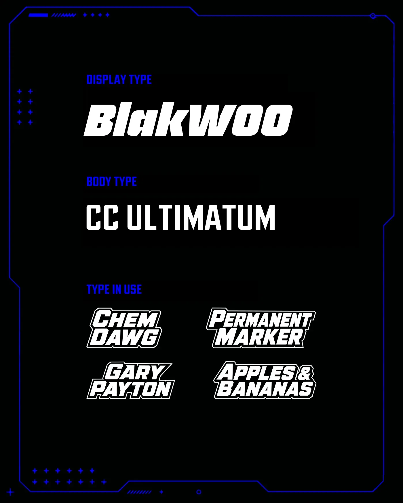
Two Voices, One System.
Headlines cut in BlakWOO — a heavy italic display that carries the kinetic energy of the mark. Paragraph and spec set in CC Ultimatum — condensed, industrial, specimen-tight.
Rows of Signal.
The star-arrow, tiled and rotated. Two treatments — a solid blue field and a reversed outline on blue — enough range to carry a surface without diluting the signal.








Built to Move.
The system in motion — the full showcase reel.



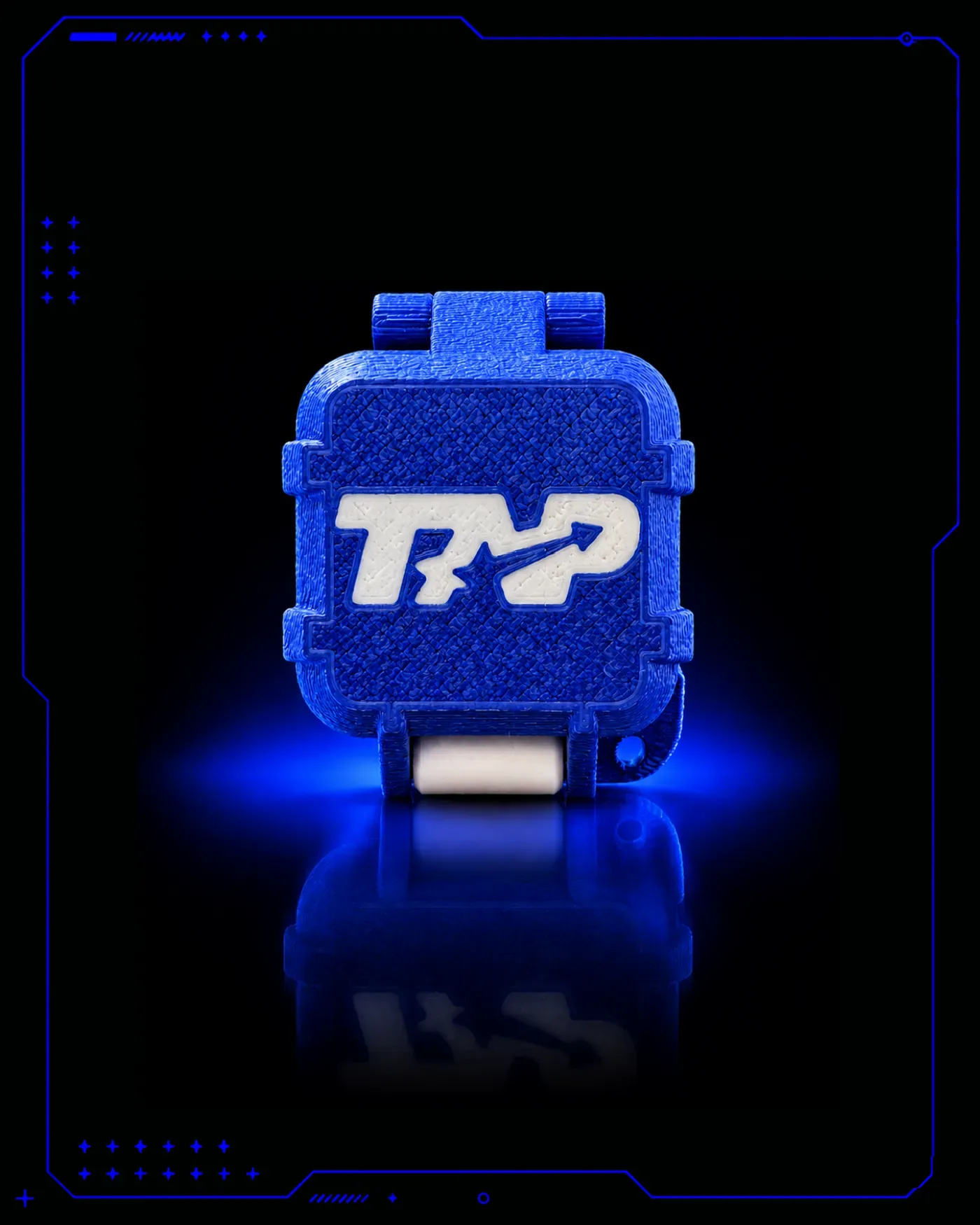
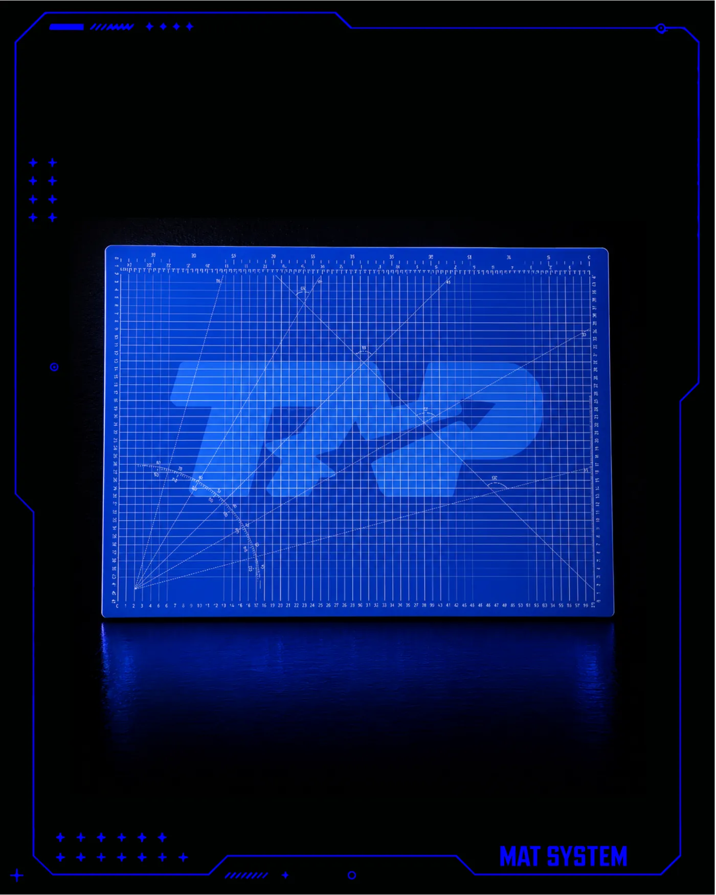
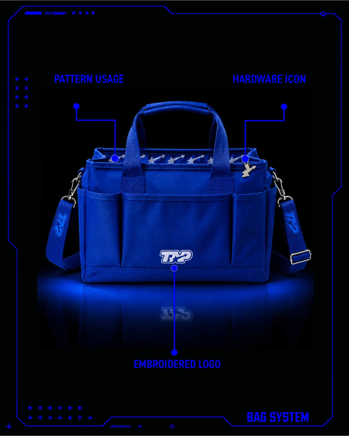
Mark to Object.
Need a Brand Built Like This?
One person, end to end — strategy, name, mark, packaging, site, and the emails that get the invoice paid. Let's send the signal.